Celebrate (?) the short-lived WWE version of WCW (and of course The Invasion!) with this WCW logo baseball cap I found on eBay.
Well, WWE’s WCW logo is slightly less ugly, and way easier to read than the hideous final logo WCW had before the buyout…
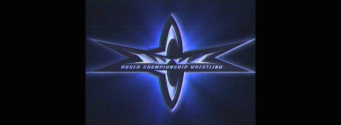
I’ll say that much for it.
But it’s also just as pointy as the previous logo- extra pointy for your pleasure (ouch!).
I’ll let you Crappers decide if that’s a positive or negative.
Still, do you really want to walk around reminding people of how terrible The Invasion angle turned out?
The Invasion won The Gooker Award in 2001 for a reason, you know.
Are you that desperate to protect your head and eyes from the sun?
Wouldn’t you rather risk severe sunburn and possibly going blind rather than be seen by other people wearing this hat?
Think about it, won’t you?
This has been a Public Service Announcement from T.S.W.S.T.O.Y.H.F (“The Stop Wearing Stupid Things On Your Head Foundation”).
Thank you.
I think it’s actually worse. At least the WCW has a decent color scheme.
I loved the WWE version of the WCW logo.
From the very first time I saw this version of the “WCW” logo appear on WWE programming, I knew beyond a shadow of a doubt that Vinnie Mac was never going to take WCW seriously during the “Invasion” angle. At least ECW was allowed to keep its’ barbed wire logo.
To be honest, only recently I realized those shapes on the WCW logo were supposed to be the WCW letters….from the shape, I just thought it was a fancy shape with the “World Championship Wrestling” and all…
Yeah, I never saw that until someone pointed it out to me, too. What a weird logo.
Holy crap, I never noticed that until now!
Makes you wonder why WCW changed their original logo in the first place. I know WCW was hitting hard times, but it was the booking not the logo that needed changing.
From what I can gather, they changed their logo because the World Wrestling Federation changed to their Attitude Era logo. They wanted to seem as with it as their competitor.
I loved the classic logo. I understand WCW was hitting hard times when they changed the logo, but it was the booking that really needed changing.
BTW, Sadly for WCW their savior was in Ready To Rumble in the gym scene. Too bad they didn’t notice him.
http://i1.ytimg.com/vi/DEamTfFZDJs/maxresdefault.jpg
I’ve never seen the film so I guess I’m missing it–who am I supposed to be noticing?
The link I posted shows a screen shot from the film. In it there’s an extra about to get into a workout machine. That man is JOHN CENA! Ready to Rumble was from 2000, Cena debuted in the WWE in 2002. If only Jimmy King, Goldberg, or any other WCW noticed him and gave him a shot. Things could have turned out a lot differently.
He was as green as a turnip at that point. There really wasn’t anything to notice.
Ah i saw the screenshot but didn’t recognize anyone so thanks for clearing it up! Knowing WCW, they probably would have put him under a mask and called him Juan Cena like he did on house shows after he was “fired” by the Nexus.
Honestly, I liked the ‘E’s WCW logo a lot more than WCW’s last official logo. Seriously what were they thinking? At least with the Invasion logo, you can tell it says “WCW” and not have to stare it for hours like Ethan Suplee in Mallrats wondering what the hell it is you’re looking at.